Point and Figure Charts
Introduction
In this module, we will learn a unique method of technical analysis through Point & Figure charts. There are different charts available through which traders can analyze price movements and patterns, such as Candlesticks, Point & Figure charts, Bar charts, Line charts, etc. Out of which, we will learn Point & Figure charts in this particular module. Each type of chart has its own characteristics and uses. 'Point and Figure' chart definitely has its own unique advantage over other types of charts. So, without any further ado, let us first get started with its origin from the next section.
History and Development
Point and Figure charts are unique to Technical Analysis. Their roots are in the markets and have fascinated Technical Analysts for over a hundred years. No one really knows precisely where the Point and Figure charts came from, or who invented them. It is unlikely that any one person invented Point and Figure charts. In fact they probably weren't invented at all. It is more likely that they were born out of necessity - a need to be able to record price movement quickly and efficiently while on the move.
The above Figure shows how a Figure chart was born. It is important to note that it was not started as a method of charting, but more as a sequential price recording method.
Traders now had a way of recording price movements that had a number of benefits:
1. The traders could trace what the price had done during the day by following the columns.
2. They could even see what the high of the day was (24).
3. They could easily see the low (8).
4. They could see the close of the day (16).
5. They could see where most of the trading had taken place by looking at the most filled in row (20).
6. It was a portable system that could be written on a paper and did not require the plotting rigorous and precise time and price scaling of a line or bar chart. Thus, time is not an ingredient of the method.
Some traders would have found it difficult to write down the price all the time, preferring instead to 'tick off' or 'mark off' the price with a dot, a tick or cross as it hit a particular price level.

By not writing numbers in each square, Point and Figure chartists had to have another way of seeing what the price level was. They introduced a vertical price scale so that the price could be marked off quickly as it moved, but they also considered the 5 and 10 levels so important that they wrote the numbers five (5) and zero (0) in the squares at these levels.
Charts constructed with Xs, 5s (fives) and Os (zeros) suffer from two problems:
It is confusing, having Xs going up as well as down. Anyone looking at the chart has to work out whether the first column is a rising or falling one, before analysis can take place. This would lead to a waste of time and would all be prone to mistakes.
It is also somewhat off-putting to see rows of Os and 5s amongst the Xs as they can be mistaken for support and resistance levels - which they are not - leading to incorrect interpretation.
The traditional chart constructed with Xs - and sometimes 5s and Os at key levels - was replaced with, in favour of a chart constructed with the letters X and 0, where Xs designated up-moves and Os designated down moves. It gave a completely new meaning to Point and Figure charts and their interpretation.

Characteristic
In the last unit, we focused on the origin of Point and Figure Charts. Now, let us learn some of its characteristics.
Point and Figure charts have the following unique features, all of which are explained in greater detail below:
- They are usually constructed with Xs' and Os' instead of lines or bars.
- Xs represent up movements in price.
- Os represent down movements in price.
- The Xs and Os are called 'boxes'
- Each X and 0 represents a discrete price interval, which is called the 'box size'.
- Price changes below this interval are ignored when plotting the chart.
- A column of Xs changes to a column of Os (and vice versa) when the price changes direction by a given number of boxes.
- This is called the 'reversal size' which is a very important aspect of point and figure.
- The columns of Xs and Os represent demand and supply.
- The chart sensitivity can be varied to show the short, medium and long-term position using the same data.
- No record is made of price gaps.
- Price is scaled on the vertical Y axis.
- There is no time-scale along the horizontal X axis.
- Time plays no part in the construction or analysis of Point and Figure charts.
- Although there is no time axis, Point and Figure charts are two-dimensional charts.
- Volume plays no part in the construction or analysis of Point and Figure charts.
- Point and Figure charts are named according to their box and reversal size.
Construction with Xs and Os
We have learned from the characteristics of Point and Figure Charts that Xs are represented as an up movement in price and Os are represented as a down movement in price. In this section, we will learn how to construct point and figure charts by using Xs and Os.
Early Point and Figure charts were constructed with numbers or figures and then these numbers were replaced by Xs, which were eventually replaced with Os and Xs.
Up moves and down moves
Xs are used to indicate up moves in price and Os are used to indicate down moves. Using two different letters makes Point and Figure charts easy to interpret. You can instantly see the general trend, and within that general trend you can see the intermediate pullbacks against the trend represented by alternate columns of Xs and Os. Computer-drawn Point and Figure charts allow XS and Os to be drawn in different colours, normally blue or green for up and red for down.
Box size
Each X and 0 is given a sensitivity value before the chart is constructed. This is called the box size. It may be 1 point, 2 point, or it may even be 50 points. No matter what value is assigned, you may not plot an X or 0 until the price has reached the next interval. For example, if each X and 0 is 50 points, then the values of ascending Xs would be 50, 100, 150, 200 and so on. A price move from 50 to 99 would be ignored because it had not reached 100.
Reversal size
The reversal size is an important part of Point and Figure chart construction. It is the number of boxes required to change from a column of Xs to a column of Os or from a column of Os to a column of Xs. Depending on the type of Point and Figure chart you are drawing, the reversal size can be I-box, which is the original method, 3-box, 5-box, or any other value.
Gaps
Point and Figure charts do not record gaps.
Demand and supply
As Point and Figure charts divide intermediate uptrends into columns of Xs and downtrends into columns of Os it is easier to understand if there is a buying pressure, or the demand, by the length of the column of Xs, or there is a selling pressure, or supply, by the length of the columns of Os.
Naming Point and Figure charts
Point and figure has two main aspects, the box size or the reversal size. The person looking at the chart needs these two parameters to understand the chart. A Point and Figure chart, where the box size is 10 and the number of boxes required to change columns is 3, is referred to as a 10 x 3 (10 by 3) Point and Figure chart. This convention leaves no room for doubt, when looking at a Point and Figure chart, as to what the box and reversal are. We will clear all your doubts while discussing 1-box & 3-box reversal charts and their construction in the subsequent units of this module.
Point and Figure construction 1-box
Firstly, let us begin with 1 -box reversal charts
A 1 -box reversal means that if the price reverses by the value of one box, an up-column changes to a down-column or a down-column changes to an up-column. Remember, up columns are usually represented by Xs and down-columns by Os. So, each time the price reverses by the value of at least one full box you move across by one column and start plotting in the opposite direction, changing from an X to a 0 or a 0 to an X.
Why change columns when price reverses?
The only reason you move across to the next column is to avoid plotting an X on top of a 0 and vice versa.
One-step-back
One-step-back can only occur in 1 -box reversal charts. It occurs when the price reverses direction by the value of one box only and then reverses back in the opposite direction. For example, if you are plotting a column of Xs and the price reverses by one box, you move across to the next column to plot the 0. You have to move across to the next column because there is no room to plot the 0 in the current column of Xs. Now you have a new second column with one 0 in it.

Consider now what happens if the price rises from 15 to 16 without first falling to 14. You need to plot an X representing 1 6, but you do not need to move to the third column to do this, because there is room above the 0 in the second column, shown by the shaded area.
Therefore, contrary to many beliefs, it is actually possible to plot both an X and a 0 in the same column.

The one-step-back is a powerful sign. When the price reverses by just one box, it may be the start of a correction or just be a temporary aberration in the trend, so you need to wait for the next plot in the column to tell you whether the trend is going to continue from the previous column or whether it is a true reversal. If it is a temporary change, the price will reverse back and when it does, the next X or 0 must be plotted in the same column.
It means that any supply during the uptrend is quickly absorbed and the demand takes control again.
- 1 -box reversal charts
- 1 -box reversal charts plot every full box movement in the price in both directions.
- Normally, a new column is started each time there is a reversal, except when there is a temporary reversal of 1 box only - called one-step-back.
- 1 -box charts are the only charts that can have an X and 0 in the same column.
- The value of the box - not the price - is taken into account when determining the next plot.
- Price changes smaller than the box size are ignored.
- There are no gaps on the chart.
- If the price gaps away, all boxes must be filled in.
IMPORTANT NOTE:
It is always the last plotted box and not the last price that is considered when deciding whether to fill the next box or change columns. We should not make the mistake of considering the last price. Once a price is used to plot an X or 0, the price itself is discarded and no record is kept. It is not possible to look at a Point and Figure chart and know what price generated any X or 0.
Point and Figure construction 3-box
Next, there are 3-box reversal charts.
Soon after Point and Figure became popular there came a need for a less sensitive chart. The 3-box reversal chart, sometimes called 3-box minimum reversal chart, was the answer. They are not a substitute for 1 -box charts, but rather a complement to them.
A 3-box reversal chart means exactly what its name implies. A change from an X to an 0 or an 0 to an X is only undertaken if the price reverses (changes direction) by the value of at least 3 boxes. lt effect gets rid of minor reversals during a prevailing trend. 3-box charts, therefore, give more weighting to the prevailing trend. The chart can never have less than 3 Xs or 3 Os in any column and, consequently there can never be an X and 0 in the same column, so no one-step-back exists in 3-box charts.
Unique asymmetric filter
3-box charts consider the value of 3 boxes when a reversal is being determined, but the value of 1 box when a continuation of trend is being determined. This gives greater weighting to the prevailing column and hence the trend. This is a unique feature of Point and Figure charts where the reversal size is greater than 1.
Consider the value of the box
It is important to note that when attempting to establish a reversal (change in columns), the value of 3 boxes is calculated from the last plotted box and not from the last recorded price. For example, if you are plotting a 10 x 3 chart and the last price in a rising market (a column of Xs) is 547, you would place an X in the 540 box. Once this is plotted, the figure of 547 is discarded and the value of the last box (540 in this case) is retained. So, in order to change columns and plot a column of Os, the price must reverse by at least 30 (10 x 3) points from the last plotted box, which means the price must reach 540-30 = 510, not 547-30 = 517.
3-box reversal charts
- 3-box reversal charts plot every full box movement in the price only if it is in the direction of the current column.
- A new column is started each time there is a reversal of the value of 3 boxes or more.
- Price reversals less than the value of 3 boxes are ignored.
- 3-box charts can never have an X and 0 in the same column, because the minimum number of boxes in any column is 3.
- The value of the box is taken into account when determining the next plot - either the same column or the reversal.
- Price changes less than the box size are ignored.
- There are no gaps on the chart.
- If the price gaps away, all boxes must be filled in.
5-box reversal charts
- 5-box reversal charts plot every full box price movement only if it is in the direction of the current column.
- A new column must be started every time there is a reversal of 5 boxes or more.
- Reversals less than the value of 5 boxes are ignored.
- 5-box charts can never have an X and 0 in the same column, because the minimum number of boxes in any column is 5.
- The value of the box is taken into account when determining the next plot - either the same column or the reversal.
- Price changes less than the box size are ignored.
- There are no gaps on the chart.
- If the price gaps away, all boxes must be filled in.
2-box reversal charts
- 2-box reversal charts plot every full box movement in the price only if it is in the direction of the current column.
- A new column is started every time there is a reversal of the value of 2 boxes or more.
- Price reversals less than the value of 2 boxes are ignored.
- 2-box charts can never have an X and 0 in the same column, because the minimum number' of boxes in any column is 2.
- The value of the box is taken into account when determining the next plot - either the same column or the reversal
- Price changes less than the box size are ignored.
- There are no gaps on the chart.
- If the price gaps away, all boxes must be filled in.
The move from intra-day to end-of-day -
Point and Figure is not only a short-term tool. It is not just for traders, but investors too. It can and should be used for both medium term and long-term analysis as well. This means that there is a place for Point and Figure charts using end-of-day data, alongside the traditional intra-day tick.
One of the problems of using end-of-day data is that there are four pieces of information with which to assess the day's trading. How these are used greatly affects the resultant Point and Figure charts.
There are two customary ways to construct Point and Figure charts using end-of-day data:
Close only method
Close only method using the end-of-day close is now the most common method of drawing Point and Figure charts for medium term traders and investors. The end-of-day close price is used instead of taking all the intra-day price changes during the day.
High/low method
High/low Point and Figure charts are more difficult to construct than close only charts, but the rules are relatively straight forward. Step through each point below:
l. Take note of the direction of the current column. Is it an X or 0 column?
2. If the column is an up-column (you are in a column of Xs) then look at the high for the day you are about to plot.
3. If the high is high enough to plot a new X, then plot the X using the high price and ignore completely the low for the day.
4. If, however, the high does not yield a new X, look at the low to see if there has been a reversal. If there is a reversal, then change columns and plot the required number of Os.
5. If the high does not yield a new X and the low does not result in a reversal, ignore the day completely.
6. If instead the column is a down-column (you are in a column of Os), then look at the low for the day you are about to plot.
7. If the low is low enough to plot a new 0, plot the ° using the low price and ignore completely the high for the day.
8. If the low does not yield a new 0, look at the high to see if there has been a reversal. If there is a reversal, then change columns (if required) and plot the required number of Xs.
9. If the low does not yield a new ° and the high does not result in a reversal, ignore the day completely.
What this effectively means is that trend always takes precedence over reversal when deciding whether to plot the high or the low.
Understanding point and figure charts
Previously, we have learned the basic constructions of Point & Figure charts. Now, let us understand the practicality of point & figure charts in technical analysis.
Point and Figure signals
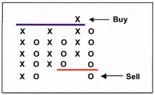
One of the great advantages of Point and Figure charts is the unambiguity of the buy and sell signals they generate. The signals are unambiguous and make the charts easier to interpret. These buy and sell signals are created by demand overcoming a resistance level or supply overcoming a support level.
Double-top and bottom patterns
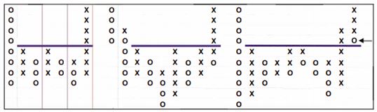
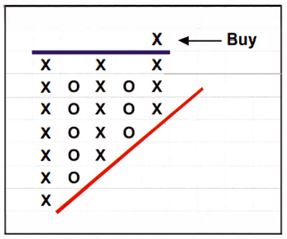
If, on a second attempt, demand, represented by a new column of Xs, overcomes supply and the column of Xs breaks above the previous column of Xs (above the blue line in Figure 3-1), this is the most basic Point and Figure buy signal. This pattern is essentially a 3-box reversal pattern that has little or no significance in I -box reversal charts.
It is referred to as a double-top when looking at 3-box charts and a semi-catapult when referring to 1 -box charts. They are, in fact, the same pattern created from exactly the same data and in both cases the signal occurs when, after a small correction, an X is plotted above the highest X in the pattern. But 1 -box charts offer more detail than 3-box charts and so the chart will look different. For this reason it is just as well to differentiate by using separate names.

Continuation double-top buy signal in 3-box reversal charts

Continuation double-top buy signal in 3-box reversal charts Nifty chart.

Equivalent semi-catapult in 1 -box reversal charts
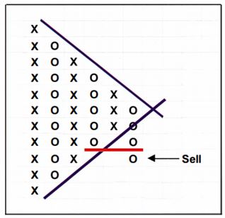
Conversely, if supply, represented by a new column of Os, overcomes demand and the column of Os breaks below the previous column of this is the most basic Point and Figure sell signal. It is called a double-bottom sell signal in 3-box charts and a semi-catapult in I -box charts. The signal occurs when a 0 is plotted below the lowest 0 in the pattern.

Continuation double-bottom sell signal in 3-box reversal charts.

Variations of bearish semi-catapults in 1 -box reversal charts.
Continuation as well as reversal
In 3-box charts, it is important to note that double-top and double-bottom patterns can be either continuation or reversal patterns, that means they can either occur after a pause during an up or downtrend, or at the end of a trend as a trend reversal. There is no distinction between them other than that continuation patterns comprise at least 3 columns, and reversal opposite comprise at least 4 columns. This is simply because a continuation pattern requires that the same column type (X or 0) leaves the pattern as entered. Therefore, a column of Xs entering the pattern leads to a reversal of a single column of Os, which in turn leads to a second column of Xs leaving the pattern in the direction the pattern was entered. The same applies to a double-bottom pattern where a column of Os enters and a column of Os leaves after a single reaction column of Xs.
The buy and sell signals are the same, except that the buy and sell signals generated from a continuation pattern are more reliable because they are in the direction of the prevailing trend. Reversal signals, on the other hand, are a complete change of mood and may initially be unreliable, or at least should be treated with caution.

Reversal double-top buy signal in 3-box charts

Reversal double-bottom sell signal in 3-box charts.

Reversal double-bottom sell signal in 3-box charts of Tata steel.
Reversal patterns in 1 -box charts
From the last unit, we have a better understanding of the usability of Point and Figure charts in technical analysis. Now, let us learn a reversal pattern in 1-box charts.
In 1 -box charts, continuation and reversal patterns have different names. As we have seen, continuation patterns are called semi-catapults but reversal patterns are called fulcrums and they take on many forms.

Variations in bullish fulcrum patterns in 1 -box charts.
Triple-Top and Bottom Patterns
Here in this section, we will learn Triple Tops and Triple Bottoms in Point and Figure charts.
All Point and Figure patterns which generate buy and sell signals are built around the two basic double-top and double-bottom patterns; however, the stronger the resistance or support, the more important the subsequent buy or sell signal. Consequently, a triple-top buy or triple-bottom sell where the level breached has been attained twice already, will lead to a stronger move.
The reason that the wider pattern generally leads to a stronger and more reliable signal is that the battle for control has taken three upthrust columns instead of two. Having been forced back twice, demand from the bulls eventually manages to overcome supply on the third attempt by breaking up above the resistance level.

Continuation triple-top buy signal in 3-box reversal charts
Continuation triple-bottom sell signal in 3-box reversal charts
1-box charts
In 1 -box charts there is no difference between the patterns as there is with 3-box double-top/ bottom and triple-top/bottom patterns. The only difference is that the 1 -box continuation semi-catapults and 1 -box reversal fulcrums are wider.
Variations in bullish fulcrum patterns in 1 -box charts
The wider the pattern and the more times the levels are tested, the stronger the resultant signal and subsequent move in that direction. Just like double-top and double bottom patterns, triple-top and bottom patterns can be continuation, as well as reversal patterns.
The strength of the pattern
Earlier, we have covered several types of patterns that generate buy & sell signals, but it is important to note that analyzing the pattern's strength is equally important. Therefore, in this unit, we understand how to analyze the strength of the pattern.
Knowing whether the pattern is likely to be a continuation or reversal pattern has important implications for Point and Figure analysis. While the pattern is being formed, there are clues to the strength of the pattern and the subsequent breakout.
Strength is influenced by two things:
1. Sloping sides
2. Breakout and pullback
Upside and downside triangles - sloping bottom or sloping top
An up-sloping bottom makes any pattern bullish to the upside because the slope means that the demand is coming in at higher levels on each reaction. A down-sloping makes the pattern bearish because supply is coming in at lower and lower levels. These triangles are known as upside and downside triangles. They are much harder to spot in bar and line charts.
Continuation upside triangle in 3-box charts

Continuation downside triangle in 3-box charts
It is important to note that the signal will not be completed until the breakout from the pattern occurs, but the sloping bottom or top gives you a clue to the direction of the breakout thus giving an advantage to the pattern. These are very similar to triple-top and bottom patterns seen earlier and like those patterns, they can be continuation or reversal.
Like all other patterns, upside and downside triangles can fail. The perfect upside triangle within a strong trend failed to break up and instead broke below the sloping bottom triggering a sell signal. This reinforces the view that while the pattern provides you with the likelihood of the break, the signal only comes when a double-top or double-bottom signal is issued.
Symmetrical Triangles - Sloping Top And Sloping Bottom
In our last topic, we have briefly described how sloping tops & bottoms influenced the strength of a chart pattern. This unit, we will further elaborate & explain symmetrical triangles pattern formation on a point & figure chart.
When you see a sloping top and bottom in a pattern, this indicates uncertainty and confusion on the part of the participants and therefore the direction of the breakout cannot be predicted with any degree of certainty. There is some evidence that the breakout is more likely to be in the direction of the underlying trend, and this tends to be the case with smaller patterns. The bigger the pattern the more likely it is to be a reversal pattern and thus it leads to a warning.
Buy signal following a symmetrical triangle
Sell signal following a symmetrical triangle
The important thing to note with these symmetrical patterns is that the signal is not given by the break of the trend line. As in all Point and Figure Analysis, the signal is generated when a breach of a previous column occurs. The buy and sell occur after a double-top and double-bottom breakout, respectively.
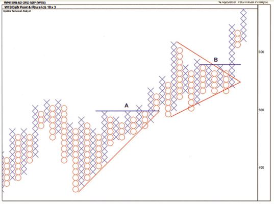
The chart of Whitbread Plc showing an upside and a symmetrical triangle.
The Breakout And Pullback
After discussing numerous types of Sloping Slides, the second factor which influences the strength of a pattern is the ability to breakout, then pullback into the pattern and finally breakout again. It is one of the strongest signals you can get in Point and Figure charts and enhances the first breakout signal. It occurs when the price breaks out of a multiple top or bottom pattern by one or two boxes but then, instead of continuing, it pulls back into the pattern, before breaking out again this makes the pattern very strong.
It is important when considering any pattern to think about the psychological make-up of the participants. The bulls are euphoric that they have managed to overcome the bears at the breakout. The bears take the opportunity of the higher prices to sell and push the price back down below the breakout point. The bulls want to buy the stock again so they once again overcome the bears to push the stock to a new high.
3-box catapult patterns
- The breakout and pullback pattern was first described as a 3-box pattern and given the name, catapult.
- Strict rules as to what constitutes a 3-box catapult are not necessary; to qualify, all it needs is the following
- A triple or multiple-top/bottom breakout.
- A double-top/bottom is not enough.
- The pattern prior to the breakout could be an extended multiple top pattern, it doesn't matter.
- What matters is that there has been a breakout from a pattern.
- Column 5 is the initial breakout column.
- This first breakout should be between 1 and 3 boxes. See column 5.
- The price must then pullback into the pattern as in column 6.
- The pullback must not generate a reverse signal.
- It must then turn around and break out beyond the previous breakout column as in column 7.
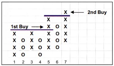
3-box bullish catapult showing the breakout and pullback.
3-box catapults can be continuation or reversal pattern.
Traps
Though we have learned several common chart patterns like Double Tops and Double Bottoms. Symmetrical Triangles etc. which are found not only in Point and Figure Charts but also other chart types like Candlesticks, Bar charts etc.
In this section let us learn some unique chart patterns that are found in only Point and Figure Charts.
First let us start with ‘Traps’.
A trap is a pattern which breaks out as expected, but then reverses back into the pattern and breaks out the other side. There is no way to avoid them. They will occur and anyone can get caught in that. The important thing to note is the point at which one should realize that your initial signal has not worked. We cannot assume that any pullback into the pattern after a breakout is a failure, because that's exactly what a 3-box catapult is. In fact, traps are really just failed catapults.
Bull trap
If we act on a triple-top buy signal and the price then pulls back into the pattern, we must not quit the position because a 3-box catapult may be building. In fact, we should remain with your initial signal until there is a double-bottom sell signal.
Bull trap: triple-top buy becomes double-bottom sell.
Bear trap
A bear trap is the opposite of a bull trap. There must be a bottom sell signal, which is then reversed into a top buy signal.
Poles
The next chart pattern we will learn are ‘POLES’
Poles are also a 3-box pattern. They are reversal patterns and never continuation.
A pole is a long column of Xs or Os with a column of Os or Xs alongside it. Although poles are reversal patterns, not every pole you see will work as such.
There are specific conditions which must apply before the pole can be considered as a reversal. There are high poles as well as low poles. It is, however, possible to see them on 1 -box charts. For a pole to occur there should be some sideways consolidation prior to the pole. Usually there is further sideways consolidation on the other side of the pole before the pattern breaks. The pole is an opportunity to enter a trade before the pattern is complete.
Poles occur when price breaks above (or below) previous price action and a long column of Xs or Os is created. This breakout column must exceed previous highs or lows by at least 3 boxes; this is what the author of the book 'Chart for Profit: Point and Figure Trading': Earl Blumenthal specifies but this may not be enough. The less the number of boxes, the greater the chance of a failure, so you should be looking for more than 5 boxes in height for poles to be effective. The reason has to do with the psychological make-up of the pattern discussed below. After the initial breakout column, the very next column must be an opposing column of Os or Xs in the opposite direction, adjacent to the breakout column. This column must retrace the previous breakout column by more than 50% for a pole to be in the making; so if the breakout column was 10 Xs, the pole will be made after the 5th 0 in the next column.
Poles can occur in uptrends or downtrends. High poles indicate near-term weakness and low poles indicate near-term strength.
Congestion analysis
In this section, we will learn 'Congestion analysis.' This congestion occurs when the price is relatively stable or moving sideways.
The importance of Point and Figure charts is enhanced by the width of any pattern. Congestion areas tend to occur after a strong advance or decline. It is the time that profits are taken and positions are reversed after the rise or decline into the area, and it is a time for adjusting to the new price level after the strong move.
Congestion is a good time to take new positions as well, provided that there is sufficient evidence as to the future direction. We need to have an idea as to the direction its going to break into before we take a position. The key to congestion analysis is to identify whether accumulation or distribution is taking place. Accumulation and distribution are identified by where the majority of the price action is taking place. Activity towards the bottom of a congestion area indicates strong support and the probability that the breakout may be from the upside. The reason is that if there is activity towards the bottom of the range - lots of small column changes - it shows buyers using every opportunity to open new positions.
Conversely, activity towards the top side of the pattern indicates strong resistance and that the break from the pattern will be to the downside. This activity shows profit taking, because sellers are taking every opportunity to close their positions or, indeed, open short positions.
Congestion patterns are simply just a combination of the basic Point and Figure patterns discussed so far.
Signals with the trend or against the trend
Point and Figure signals start with double-tops and bottoms in 3-box charts and with semi-catapults in 1 -box charts. These are weaker than triple-tops and bottoms, but many double-tops and bottoms are good reliable signals.
In a strong downtrend, for example, double-bottom sell signals would be much more reliable than double-top buy signals. Each cell can be taken but a double-top buy should be dealt properly, until there is more evidence of a trend reversal.

The above figure shows the price in a strong downtrend. Each double-bottom sell signal is good for acting on. However, the double-top buy signal should be used only for closing out short positions and not for going long until more price movement confirms the end of the downtrend.
You can dramatically improve your success rate just by taking clear signals with the prevailing trend.
The opposite is true for a strong up trend, where double-top buys can be relied on and double bottom sells are treated with suspicion unless and until there is a strong reversal.
Trend Lines On Point And Figure Charts
Similar to how we draw trendlines on any other price charts like line charts, bar charts, or candlesticks, in this unit, we will learn to draw a trendline on point & figure charts.
Trend lines play a very important role, if not an essential, part in Point and Figure analysis. With line and bar charts, trend lines show the line at which there is a constant rate of change. This is because line and bar charts show price versus time. The trend line on a bar chart therefore shows constant change in price per unit time.
With Point and Figure charts, however, there is no time. Instead, the x-axis shows the number of columns, which is the number of times the price has reversed. So, a trend line on a Point and Figure chart shows constant price change per reversal.
Rate of price rise per reversal.
Trend line breaks
In Point and Figure analysis, signals are generated by double-top and double-bottom signals in 3-box charts, and by catapults and semi-catapults in 1 -box charts.
They become important when assessing trend line breaks and the validity of the trend line. At point A in the Chart, the downtrend line from the top was breached, but there was no Point and Figure signal at the time. This allows the trend line to be continued through the data. There are many times the price touches the line (shown by the arrows), increasing its validity. The break at point B however, is accompanied by a semi-catapult buy signal, confirming the break.
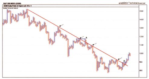
Here are some guidelines for breaks of a downtrend: If, at the time the break occurs, there is also a double-top (or wider), a catapult or a semi catapult buy signal, as shown at point B in Chart, then the break is valid and should be acted on. The break at point A is invalid.
If, at the time of the break, there is no Point and Figure signal, look to see if one occurred just prior to the break. 'Just prior to' means that the signal must have occurred within an X or two of the trend line break. This still makes the break at point A an invalid break.
Left at point A we see two columns of Xs at the same height as the X at point A. If at point A another X had printed, there would have been a catapult breakout and that would have made the break of the trend line valid. In the case of Point A as it exists, this did not occur and it remains an invalid break.
Bullish Support And Bearish Resistance Lines
Subjective trend lines (the ones which we draw it ourselves) like the chart in the last unit can be used to good effect, but one of the great advantages of Point and Figure charts is that you can also draw objective trend lines.
The objectivity means that you do not need to decide on the angle of the trend line: it is already established. Because of the 'square' nature of Point and Figure charts, it is possible to draw 45° trend lines, something which is impossible on bar or line charts because of the aspect ratio.
With Point and Figure charts, the aspect ratio is a constant 1: 1 because they are constructed on a squared grid. To maintain a 45° trend, therefore, and the price action above the trend line, the price must rise by more squares up than squares sideways. Squares up or down are created by the price rising or falling by the box size, and squares across are created by the price oscillating without any direction.
Bullish support lines are rising trend lines drawn at 45° from an important low. Bearish resistance lines are falling trend lines drawn at 45° from an important high.
45° lines are not drawn just for the sake of it. They have an important meaning. They show the rate at which the price is rising or falling by one box every time a new column is formed, in other words, every time the price changes direction.
Where to draw bullish support and bearish resistance lines?
Bullish support lines are drawn at 45° up from a known important low point. They are drawn by taking a diagonal through the comers of the square below the low of the lowest column of Os. The advantage is that as soon as a bottom is made, and a column of Os reverses to a column of Xs, the bullish support line can be drawn. So we get an important point from where we can draw the trend line. There is no need to wait for a further reaction to give a second touch point, none is needed. Bearish resistance lines are drawn at 45° down from an important high point in the same way, by drawing a diagonal through the comers of the square above the highest column of Xs.

Drawing 45° bullish support and bearish resistance lines.
When drawing these internal or shorter-term 45° lines, it will be stronger if drawn off an actual reaction high or low, rather than just a single reversal column. This means that those drawn off mini-bottoms or mini-tops are more important than those drawn from a corrective column. For example, trend line 8 is drawn from a mini-top, whereas trend line 3 is drawn from a corrective column. If a trend line is drawn from a corrective column, like trend line 4, and it provides support to a mini-bottom like point B, the trend line is regarded as if it had been started from a mini-bottom. The converse applies to mini-tops.

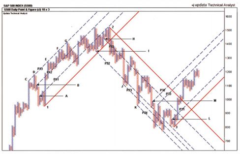
Parallel Trend Lines
Earlier we have learned to draw a single trendline on point & figure charts but now we will learn to draw parallel trend lines or commonly known as Channels.
Channels are important. Prices tend to move up and down within channels, and so lines parallel to the trend, but on the opposite side of the price action becomes important channels for understanding the strength of the trend. In an uptrend, these lines offer resistance to the price and in a downtrend they offer support. If the price fails to reach the upper channel in an uptrend, this is a sign of weakness as the bears bring the price down before it reaches the upper line of the channel. Conversely, if they fail to reach the lower channel in a downtrend it is a sign of strength.
In Point and Figure analysis, the parallel line to the uptrend bullish support line is called the bullish resistance line. The parallel to the downtrend bearish resistance line is called the bearish support line.
Key takeaways from Point and Figure charts
Here are some key takeaways from this module so far.
- Point and Figure charts show the demand and supply: demand pushes up a column of Xs, supply pushes down a column of 0s.
- When demand overcomes supply, and an X breaks above the previous column of Xs, a basic Point and Figure buy signal is generated. When supply overcomes demand, and a 0 breaks below the previous column of 0s, a basic Point and Figure sell signal is generated.
- All Point and Figure patterns and signals are based on these basic patterns in various combinations.
- The wider the pattern, or the more times a level is challenged, the stronger the buy or sell signal from the pattern.
- Point and Figure patterns can be continuation, as well as reversal, patterns.
- The ability to breakout, be forced back and then breakout again is a strong sign.
Patterns vary according to the reversal size used.
1-box patterns:
- Less rigid formations than 3-box patterns.
- Fall essentially into two categories: semi-catapult and fulcrum.
- Semi-catapults are continuation patterns.
- Fulcrums are reversal patterns.
3-box and other box patterns:
- More rigid and recognisable formations than those in 1 -box charts.
- Easier to categorise and name.
- All decompose into either of the 1 -box chart patterns.
- Not every buy and sell signal should be taken, as it could be part of a larger, more complex pattern.
- Always look left to see additional support or resistance.
- Sloping bottoms make patterns more bullish, sloping tops make patterns more bearish, whereas sloping tops and bottoms indicate uncertainty.
- Sideways movement or congestion is an important part of Point and Figure analysis and indicates accumulation at bottoms and distribution at tops.
- Analysis of congestion helps to predict the likely breakout direction.
- Trend lines are vital to Point and Figure analysis and no Point and Figure chart should be drawn without them.
- Trend lines at 45° provide an objective way of establishing trends in 3-box charts.
- Taking note of the trend enhances standard Point and Figure signals.
Projecting Price Target
One of the biggest advantages of Point and Figure charts is 'the count', as it is called, which is the ability to project price targets from the chart. As with 45° trend lines, these counts are objective. They are potential targets that give the analyst an idea as to how far the price can go. It is important to stress the word 'potential'. These targets are a rough estimate.
Two methods are used to establish price targets: horizontal and vertical counts. 3-box reversal charts allow both vertical and horizontal counts, whereas 1-box charts allow horizontal only. We will discuss each of them in our subsequent units.
Counts on 1-Box Reversal Charts
Firstly, let us start with 1-box reversal charts.
It is not possible to conduct vertical counts on 1 -box reversal charts, because, as you have seen earlier, columns can contain both Xs and Os, so only horizontal counts are possible.
These horizontal counts are not quite as effective as counts on 3-box charts, partly because the counting method is not as precise.
The logic behind the count is that the width of the pattern determines the extent of the subsequent move, and the area where most of the action has taken place is the level at which the count is taken. This is the pivot or anchor point, about which the pattern balances.
One advantage of horizontal counts on 1 -box charts, however, is that they can be used effectively for counting across any congestion pattern, including continuation patterns. Every pattern yields a valid upside as well as a downside count. Once obtained, you must decide at the time the breakout occurs whether it is the upside or the downside that is activated.
How to establish a horizontal count on 1 -box reversal charts
Step 1 - Look for a congestion pattern you must look for a congestion pattern, which could be a top, a bottom, or a continuation pattern.
At the time of counting, you may not actually know what it is. It is only when the price breaks out of the pattern that you will. It is for this reason that every pattern yields valid upside, as well as downside, counts up until the breakout.
Step 2 - Measure the width of the congestion pattern using the following rules:
There are four methods used to measure the width of the pattern in no particular order.
Method 1
Count the number of columns in the row that has the most filled boxes, that is to say the row with the most Xs and 0s. This is where most of the price action has taken place and, therefore, where the strongest part of the pattern is. It is the level that has been crossed the most times and can be regarded as the anchor point for the pattern. The number of boxes in the row is counted from the far left to the far right of the pattern, including any empty boxes that do not have an X or 0. You are, therefore, measuring the total width of the pattern based on the width of the row you have chosen. The logic is that the more times a price level is passed through within the congestion pattern, the more important that price becomes in defining the width of the pattern. Please note that the row with the most filled in boxes is not necessarily the longest row in the pattern. You are not counting the longest row; you are counting the length of the row that has the most activity within the pattern.
Method 2
Count the width of each row within the pattern and divide by the number of rows to give the average row width, rounded up to a full box size. The trigger row is taken to be the row in the middle of the pattern.
Method 3
If the pattern has 'walls', that is to say a clear column entering the pattern and a clear column exiting the pattern, then count the number of columns in the pattern, the right-hand wall across to, and including, the left hand wall.
Method 4
Method 4 Count the width of the pattern (number of columns) at the breakout or catapult point. This will either be the width between the entry and exit walls at the catapult point, or, if none exist, it will be the width of the pattern one row below the catapult point.
Step 3 –
Project the count up and down by an equal number of boxes Multiply the number of columns calculated in step 2 by the box size (the value of each X and 0).
Add this number to the value of the box in the row from which the count was taken, to achieve an upside target.
Also subtract this number from the value of the box in the row from which the count was taken, to achieve a downside target.
If the pattern has already broken out then you will already know the direction, so only the target in the direction of the breakout is valid.

Horizontal counts on a 1 -box reversal chart showing rows that may be counted.
Counts on 3-box reversal charts
Now, we will learn '3-box reversal charts'.
3-box charts lend themselves to two counting methods, vertical and horizontal, because of the way the chart is constructed.
It is important to note at this stage, that 3-box counts cannot give an upside and a downside target from the same pattern. Only one direction is possible and is triggered on a breakout of the pattern.
Vertical counts on 3-box reversal charts
- The vertical count measures the length of a column of Xs or Os and projects it by 3 times that length.
- That is the easy part; however, choosing the correct column to count is important, so careful notes must be made of the following guidelines.
- Vertical counts may only be established from the following columns:
- The first move up off a bottom; in other words, the first column of Xs after a bottom has been made.
- The first move down off a top; in other words, the first column of 0s after a top has been made.
- The second moves off a bottom if the second column is part of the bottom pattern, namely that the bottom is made up of either two Os at the same level, or two 0s where the second 0 is only one box higher than the first and if the first column of Xs is a short column.
- The second move off a top if the second column is part of the top pattern, namely that the top is made up of either two Xs at the same level, or two Xs where the second X is only one box lower than the first, and if the first column of 0s is a short column.
- Any other significant X or 0 column. This is not a licence to count every column you see. 'Other significant column' means either an intermediate mini-top or mini-bottom during an uptrend or downtrend, or a breakout column from a congestion area.
- At this point it is important to understand that only these column types may be used to establish vertical counts. No other column should be counted, as this devalues the method and results in too many counts, giving a false impression as to the count's effectiveness.
Step 2 - Count the number of Xs in the column and calculate the count. Once the column has been chosen, and its length fixed by the emergence of a new column in the opposite direction, count the number of Xs in the column.
Multiply the number of Xs by the box size (the value of each X and 0).
Multiply this product by the reversal, which is 3.
Add this total to the value of the lowest 0 in the column of 0s immediately to the left of the counting column.
You now have the upside target, which you may mark on the chart.
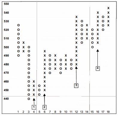
Vertical upside counts on a 3-box reversal chart showing columns that may be counted.
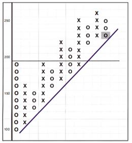
Count 1
The price falls to a low in column 3. Column 4 is the first column of Xs off the bottom. This allows count 1 to be established, once a reversal of 3 Os has been plotted in column 5 as follows:
Target = (number of Xs in column 4) x (box size) x (reversal) + lowest low in column 3.
There are 4 Xs in column 4, the box size is 5 and the reversal is 3.
The value of the lowest 0 in column 3 is 440.
Target = (4 x 5 x 3) + 440 = 500
Count 2
You may count the second column off the bottom if the first column is short. Count 2, therefore, utilises column 6 as follows:
Target = (number ofXs in the column 6) x (box size) x (reversal) + Lowest low in column 5 •
There are 10 Xs in column 6, the box size is 5 and the reversal is 3.
The value of the lowest 0 in previous column 5 is 445. Target = (10 x 5 x 3) + 445 = 595
Count 3
To establish any additional count on the chart, you must find a significant column according to the rules.
The price spends a number of columns consolidating sideways after the move off the bottom but finally breaks out of the congestion area in column 12.
Column 12 changes the look of the chart and is, therefore, a significant column.
It is a column that has changed the look of the chart, so count 3 can be established as follows:
Target = (number of Xs in the column 12) x (box size) x (reversal) + lowest low in column 11
There are 12 Xs in column 12, the box size is 5 and the reversal is 3.
The value of the lowest 0 in column 11 is 475. Target = (12 x 5 x 3) + 475 = 655.
Vertical count establishment and activation
It is important to note that there are two stages to the vertical count. There is the establishment stage and the activation stage.
The establishment stage occurs when the length of the column being counted is fixed by the addition of a new column in the opposite direction. The count can then be performed and a target established. The count and the target cannot, however, be considered active until there has been a break above the highest X in the counting column (in the case of an upside count), or a break below the lowest 0 in the counting column (in the case of a downside count).
Horizontal Counts On 3-box Reversal Charts
In the last unit, we have learned vertical counts on 3-box reversal charts; now, let us learn horizontal counts on 3-box reversal charts.
The horizontal count measures the width of any congestion top or bottom pattern and calculates it by 3 times that width.
Horizontal counts do yield worthwhile targets and should be used whenever possible, especially where they confirm vertical counts.
How to establish upside targets using the horizontal count method on 3-box charts
Step 1–We have to look for a congestion pattern at the bottom.
Look for any bottom patterns at the end of a downtrend that have the shape of a U, V or W.
The shape of the pattern is not so important, but it must have walls.
There must be a column of 0s entering it and a column of Xs leaving it.
Between the entry and exit columns, there must be some consolidation or congestion for the count.
Step 2 - Count the number of columns in the pattern
Once the entry and exit columns have been chosen, count the number of columns across the pattern, including the entry column of 0s and the exit column of Xs.
Multiply the number of columns by the box size (the value of each X and 0).
Multiply this value by the reversal, which is 3.
- Add this total to the value of the lowest 0 in the pattern.
You now have the upside target, which you may mark on the chart.
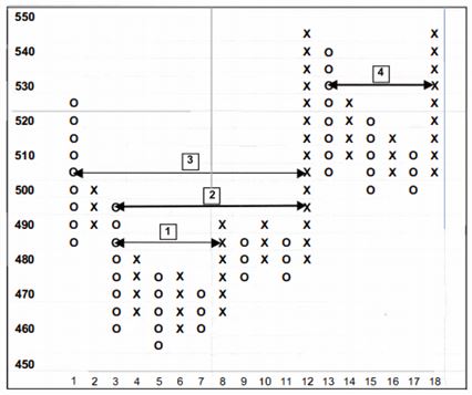
Horizontal upside counts on a 3-box reversal chart showing rows that may be counted.
There is a big bottom pattern bounded by columns 1 and 12. This allows a count to be established. Target = (number of columns in the larger pattern) x (box size) x (reversal) + lowest low between columns 1 and 12 There are 12 columns between the walls (including the walls), the box size is 5 and the reversal is 3. The value of the lowest 0 in the pattern is still in column 5, which is 455. Target = (12 x 5 x 3) + 455 = 635.
Things You Should Know About Point And Figure Counts
Point and Figure Charts is a vast module. We have gone through a lot of topics since the beginning of this module. However, there are a few more things to learn such as:
1) Targets have no time-scale
Although we have been given a target, there is no time-scale for its achievement. The fact is that Point and Figure charts have no time-scale, so it is impossible to calculate when a target - vertical or horizontal - will be reached. It is futile to attempt to do so.
2) Nearest counts must be achieved first
On the upside, lower targets have to be achieved before a higher count can be considered. If a lower target is not achieved, then the achievement of the higher count is obviously impossible.
By all means, select counts that cluster around a target, but do not select one that is double the next target. Its presence on the chart will give you a distorted view of the future.
3) Clustering of counts
We have already been advised to avoid trying to count every column; however, there will be times when a number of valid counts, both vertical and horizontal, may be obtained from the same area of the chart. Normally when there is a horizontal count, there will be a vertical count from the breakout column. Any clustering of these multiple targets reinforces the likelihood of that particular target being achieved.
4) Negating a count
Not all counts will be achieved, so there has to be a process for removing them from your analysis. A vertical upside count is negated when the price falls below the low that anchored the count.
Conversely, a downside count is negated when the price rises above the top that anchored it.
5) Combining counts with trend lines
The validity of counts is enhanced by the use of trend lines, especially 45° trend lines.
An upside count is more likely to be achieved if it occurs when the count column is above a 45° bullish support line.
A downside count is more likely to be achieved if it occurs below a 45° bearish resistance line.
We need to be very careful when we establish a count on the opposite side of the prevailing trend. They can, however, be useful because their achievement or non achievement does explain more about the underlying nature of the trend in place.
6) Improbable and Impossible counts
Always be on the lookout for counts that are impossible or improbable. Impossible counts are easier to spot because they give a figure that is impossible. This can only happen with downside counts and occurs when the downside count yields a value less than 0.
Often, if this happens, the next column can be used.
Risk-Reward Ratio From Vertical Counts On 3-Box Charts
The risk-reward ratio is the ratio of the potential gain from any trade, derived from the Point and Figure count, to the possible loss if the trade goes wrong and the price goes in the opposite direction, derived from Point and Figure double-top and double-bottom signals.
Risk-reward ratio from vertical counts on 3-box charts
There are two stages to the vertical count –first is the establishment and next is the activation. The risk-reward ratio can only be computed once the count has been established and the activation column is in the process of being built.
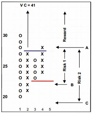
The above figure shows a typical bottom.
After the first column of Xs in column 2 off the low, the establishment stage takes place when the length of the column of Xs is fixed by the reversal of a column of 0s in column 3.
At this stage the vertical target can be established and the reward calculated.
The reward is the difference between the vertical target and the price at the breakout above the highest X in the counting column of Xs.
The length of the correction column of 0s in column 3 is fixed by a reversal of a column of Xs in column 4.
At this stage, the risk may be calculated.
The risk is the difference between the price at the breakout above the highest X in the counting column - above the blue line - and the value of the 0 below the correction column of 0s - below the red line.
The calculation is as follows: The vertical target is the number of Xs in column 2 multiplied by the box size, multiplied by the reversal, added to the low in column 1.
Vertical target = (7 x 1 x 3) + 20 = 41
The reward is the vertical target minus the price at the double-top breakout above the blue line, marked A. Reward = 41 - 28 = 13
The risk is the price at the double-top breakout minus the price at which the first double bottom sell would appear on the chart if the price went against the trade - below the red marked B. Risk 1 = 28 - 22 = 6
Risk-reward ratio 1 = Reward/Risk = 1 3/6 = 2. 17
A good risk-reward ratio is around 3 or greater. Short-term traders will accept lower risk-reward ratios that are sufficiently greater than, say, 1.0 to 1.5.
Risk-reward ratio from horizontal counts on 3-box charts
The problem with horizontal counts is not the reward but the risk, because the exit from the pattern can be quite complex.
Although we always put the stop below the lowest low in the pattern, this results in increased risk levels.
It is, therefore, best to study the pattern and determine subjectively where your stop should be placed.
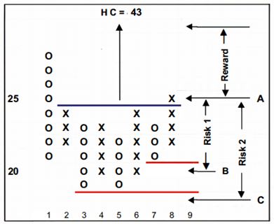
Calculating risk-reward ratios from 3-box horizontal counts
Risk level 1 is the price at which the first double-bottom sell wouldappear on the chart if the price went against the trade (below the red line, marked B), whereas risk level 2 is the row below the low of the pattern, marked C.
The horizontal target = (8 x 1 x 3) + 19 = 43 The breakout row is at 25, marked A.
The reward = 43 - 25 = 18
Risk 1 = 25 - 20 = 5
Risk 2 = 25 - 18 = 7
Risk-reward ratio 1 = 1 8/5 = 3.60 Risk-reward ratio 2 = 1 817 = 2.57
You therefore have two risk-reward ratios to work with and may allocate your trade accordingly.
Normally, however, the low of the whole pattern would be the greatest risk level.
Point & Figure Indicators
Though we have learned different technical indicators in our earlier module - Technical indicators, we use slightly different technical indicators in the case of point & figure charts. Let us explain how?
Point and Figure charts should not be drawn of any smoothed indicator. Indicators that are smoothed by using any or other averaging technique means the resultant Point and Figure chart will not be of much use. MACD18 and slow stochastic19 are examples of smoothed indicators. That leaves three types of indicator which can be drawn using the Point and Figure method.
Relative strength 20 against another instrument
Cumulative lines such as on-balance volume.
Oscillators such as RSI and momentum.
Point and Figure of relative strength
Relative strength shows relative performance, not absolute performance. A rising relative strength trend does not mean that the stock (numerator) is rising, it simply means that the stock is performing better than the index (denominator). It could mean that the stock is falling but not by as much as the index; or it could mean that the stock is trading sideways but the index is falling; or it could mean that they are both rising but the stock is rising more than the index. The converse applies with a falling relative strength trend. It shows the rise and fall as compared to the underlying index.
When drawing Point and Figure charts of relative strength, scaling becomes an issue because relative strength is a ratio of the price of one instrument to the price of another and therefore has very small or very large numbers. The preferred method, therefore, is to normalise the relative strength data before plotting the chart, by dividing each relative strength value by the first relative strength value in the series and then multiplying by 100. This makes construction easier and has the additional benefit that all relative strength charts become directly comparable.
Using Point and Figure counts on relative strength charts
Point and Figure counts can be used on Point and Figure charts of relative strength, but remember the numbers don't really mean anything. It is the level that you are looking for. Counts are potential targets, the achievement or non-achievement of which gives you more information about the quality of the trend.
Point and Figure of on-balance volume
Point and Figure charts don't show volume but volume may be incorporated by drawing Point and Figure charts of on-balance volume (OBV). It lends itself to the Point and Figure representation because it is a cumulative line where the values that are used to construct the line have no meaning.
As with relative strength, the main analysis of OBV is the trend. A rising trend in an OBV chart indicates accumulation, whereas a falling trend indicates distribution. OBV shows the presence of informed buyers and sellers. It can show accumulation taking place prior to a price rise and distribution prior to a price fall. The rationale behind it is that high volume combined with a price move indicates powerful informed investors taking positions. For this reason, it can show the presence of trading on sensitive information.
The biggest problem with Point and Figure of OBV is that it can have large values, depending on the volume of the share in question.
Point and Figure of oscillators
In theory any oscillator may be drawn as a Point and Figure chart. As stated earlier, smoothed oscillators such as MACD should, however, be avoided, as the lack of minor trend changes results in long columns of Xs and 0s which render the Point and Figure chart useless. Remember, Point and Figure charts thrive on reversals.
Oscillators such as momentum, overbought/oversold, commodity channel Index and RSI do work well in Point and Figure format, but there is, in fact, no limit to the indicators that can be drawn using Point and Figure charts rather than line charts.
Summary
- Point and Figure is a method for representing any series of numbers. Most often those are prices, but Point and Figure charts can also be drawn of any calculated line which can then be subjected to all the power of Point and Figure analysis.
- Smoothed indicators should be avoided because Point and Figure thrives on volatility.
- The most common indicator to be represented as a Point and Figure chart is relative strength.
- Point and Figure works well with any cumulative line, such as OBV.
- Oscillators which are not smoothed also benefit from Point and Figure representation.
- Point and Figure counts can be used to calculate targets for the indicator, although they do not work with fixed scale indicators. The value of the count used on indicators is not important, rather it is the level that the count projects.
Point And Figure’s Contribution To Market Breadth
There are many indicators that measure breadth in different ways, but the thinking behind all of them is the same.
The advance decline line is one of the most popular. It calculates the number of shares that have advanced on the day and the number that have declined. The difference between the advances and declines is added to or subtracted from a running total, which is then plotted.
Advance decline lines are drawn as line charts, but they can of course be drawn as Point and Figure charts. As they are not based on Point and Figure, however, they have no place in a book on Point and Figure charts. There is, in fact, only one breadth indicator that is purely Point and Figure and that is bullish percent, discussed below.
The point of breadth indicators is that they are an independent measure of the market or sector index. For example, if, on a day when all shares in Nifty fell or remained unchanged, one of the biggest shares in the index rose by 5%, the index itself would rise. Would that index rise be a true reflection of the market for that day? It would, in fact, be misleading. Market breadth, on the other hand, would count 99 shares down or unchanged and only 1 share up, giving a strong downward bias on the day. It brings another dimension to the analysis of indices and markets.
Bullish percent
Point and Figure charts are either bullish or bearish - that is a major advantage of them that they give a clear picture. A bullish Point and Figure chart is one where the last signal generated was at least a double-top buy signal.
To construct a bullish percent chart we will have to draw a Point and Figure chart of every share in the index we wish to study, on the day you wish to study it. We then have to count the number of shares that have, as the last signal, at least a double-top buy. The number is then expressed as a percentage of the total number of shares in the index. The resultant percentage is then used as the next data point to construct another chart, which is the bullish percent chart. The next day, the whole procedure is repeated, making the creation and maintenance of any breadth indicator a tedious task.
The more common Point and Figure version of bullish percent cannot be lined up with the price chart but it has two advantages: firstly, normal Point and Figure double-top and bottom signals apply; and secondly, the last column tells you the status of the market. A rising column of Xs means the market is bullish and is continuing to be so. A falling column of 0s means the market is bearish because an increasing number of shares are turning bearish.
- A.W. Cohen, the originator of bullish percent, only used the Point and Figure version and never the line chart. His rules for reading it were simple:
- A rising column of X below 50% is a bull alert signal.
- When the column of X crosses above the 50% level, the bull trend is confirmed.
- However, if the column of Xs is below 50% and issues a double-top buy then the bull trend is confirmed earlier.
- A falling column of 0s above 50% is a bear alert signal.
- When the column of 0s crosses below the 50% level, the bear trend is confirmed.
- However, if the column of 0s is above 50% and issues a double-bottom sell then the bear trend is confirmed earlier.
- He added that any turn up from below 10% is a signal for a new bull market.
Analysing bullish percent as a line chart
A line chart of bullish percent is not used often, but it should not be ignored because it can show things that the Point and Figure version does not. The main reason it is used is that it can be plotted below the index itself and thus compared on a day-to-day basis. We have to remember that although a line chart is plotted, the foundation of the indicator is still in Point and Figure because it uses the percentage of bullish Point and Figure charts each day throughout the entire history.
- The bullish percent Chart should be constructed as follows:
- Each day, total the number of shares that display a bullish pattern (last signal a double top buy).
- Express that number as a percentage of the total number of shares of Nifty Index.
- Plot the bullish percentage each day.
The bullish percent line chart can be regarded and analysed as if it is an overbought/oversold oscillator, where anything above 70% is considered overbought and anything below 30% is considered oversold.
A break below 70% is not a sell signal. 'Overbought' itself is not a sell signal, just as 'oversold' is not a buy signal. Strong uptrends can stay overbought for months, even years. Provided the bullish percent remains above 70%, the uptrend in the underlying index is strong and intact. It means that 70% of its constituents have bullish Point and Figure charts.
A break below 70% shows a slowing down and perhaps a weakness in the uptrend, but does not signal that the uptrend is at an end. It just indicates that trends cannot accelerate forever; they need a period where the speed of the rise is constant or even slowing. A break below 70%, therefore, simply tells you that some of the overbought nature has been relieved by some shares turning bearish - most likely the overextended ones. So they indicate the trend has slowed down rather than reversed.
Because of their very nature, indices tend to remain overbought much longer than they remain oversold. Therefore, dips below the 30% level into oversold territory are usually short-lived, and a break back above the 30% level is a strong new bullish signal. It means that only 30% of stocks have bullish patterns but that number is increasing. The fact that it is increasing means that more charts are becoming bullish and less are turning bearish.
It is the 50% line, however, that is the real indicator of trend change. A break above 50% indicates a change to a bull trend and a break below 50% indicates a change to a bear trend. It would, however, be wrong to assume that trends change at the 'flick of a switch' and so sticking rigidly to the 50% level as the indication of a trend change is unwise. It is better to draw a 2.5% band either side of the 50% level and regard the crossing of the band edges as the signal. If the bullish percent falls to the band and bounces back towards the 70% level, it is a reinforcement of the uptrend in the index.
The area between 70% and 30% is the trend change area. If the bullish percent oscillates above and below the 50% band without ever reaching 70% or 30%, this indicates uncertainty about the prevailing trend, suggesting that it is ending and is in the process of being replaced by a trend in the opposite direction after a period of sideways movement. At this time, positions in the market are best avoided until the trend becomes clear again.
The strongest trend change signal that bullish percent can give is when it breaks below 70%, then goes on to break below the 50% and then the 30% level without much interruption. It is a clear signal that a bull trend has ended and we need to be cautious. The reason is that there is a steady decrease in bullish Point and Figure charts and consequently increase in bearish ones. To turn a bullish chart bearish requires a double-top buy signal to be reversed into a double-bottom sell signal.
Conclusion
Finally, the module has come to an end. It is now time for you to start practising because that's what makes a trader successful. As we have covered each and every topic related to Point & Figure charts in this module, there are hardly any other topics left to cover. So, buckle up to implement all the learning from this module into the practical application in the market. The more you apply what you have learned, the more experience and expertise you will gather, which will eventually make you a pro-trader. Though markets are dynamic in nature and it is evolving day by day. You need to cope-up with the dynamics in order to become successful in trading. For this very reason, we are continuously updating our modules on ELM School. Be sure to read them all and gather the necessary knowledge & skill to become a successful trader.


